This report is in Beta, which means you can explore and get an early look at what’s coming while we continue to build and improve it based on your feedback.
How it Benefits You:
- Clear oversight: See where cases are being raised across locations at a glance.
- Spot trends: Simple charts show month-by-month changes and emerging case types.
- Highlight priority areas: Highlights which locations or categories receive the most cases.
- Compare performance: View case volumes across locations and categories to understand patterns
- Drive accountability: Clear ownership to ensure timely progression.
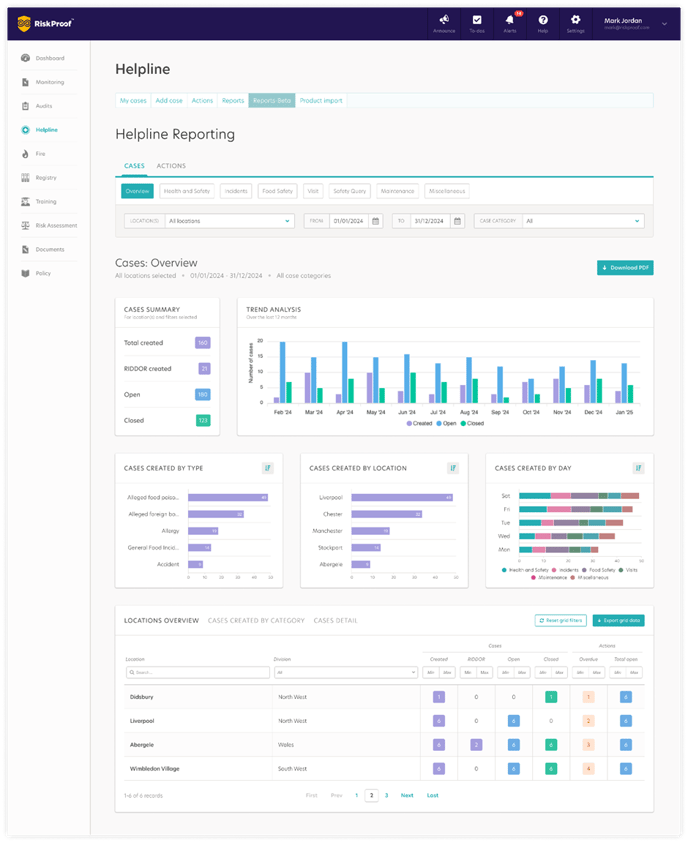
How do I access the new style ‘Cases Overview’ report?
- Navigate to the Helpline Module
- Click on the ‘Reports-Beta’ tab
- Click on the ‘Cases’ tab
- Click on ‘Overview’
Cases Overview Report Breakdown
Page Level Filtering:
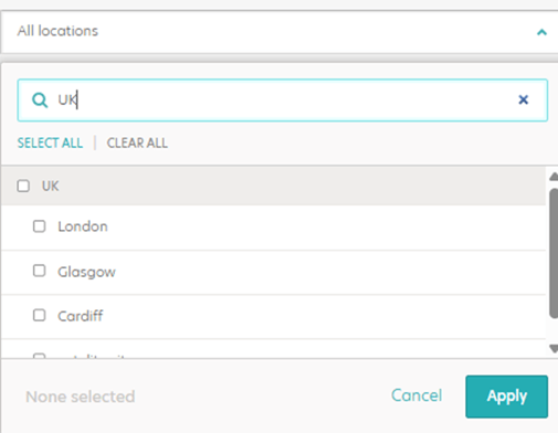
- Location: The ‘Overview’ report defaults to displaying data for all locations you have access to. You can narrow your focus using the Location Selector filter, allowing for quick customisation. Once applied, charts and data grids update immediately reflecting data based on the chosen location(s).
- Date Range: The ‘Overview’ report defaults to displaying data for the last 30 days, counted back from the current day. To change this, pick a start and end date in the From and To Once applied, all charts and tables update straight away to reflect your chosen timeframe.

Special note:
When you choose your own date range, the report shows how each case was recorded during that time. For example, if a case is now marked as ‘Closed’ but was ‘Open’ during your selected dates, the report will show as ‘Open’.
- Case Category: Use the Category filter to focus the report on specific categories or view them all. Choose the categories you want to see and the charts and tables update to match your selection.
Data Charts:
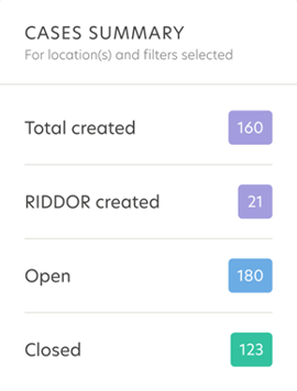
- Cases Summary – This includes key performance indicators (KPIs) to help you monitor the status of cases at a glance. These figures display the total number of cases, including Total Created, RIDDOR Created, Open, and Closed, giving you a quick snapshot of overall case activity and organisational performance.
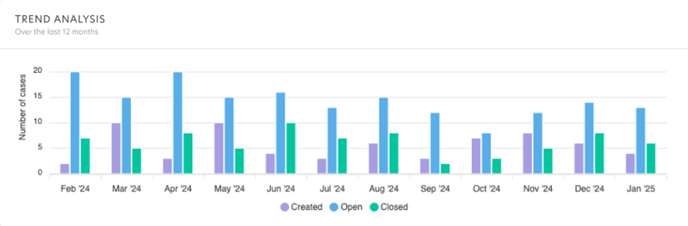
- Trend Analysis: Shows a 12-month bar chart with the number of cases by status each month (Created, Open and Closed). It helps you compare month-on-month activity, see where volumes are increasing or decreasing, and spot spikes or dips. Use this view to monitor overall case trends and understand how volumes and statuses are changing over time.
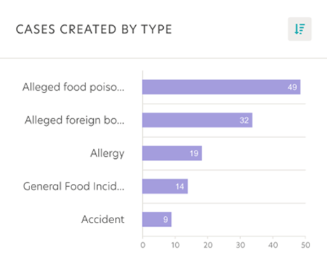
- Cases created by type: This card shows the top 5 case types created with the within the specified date range.
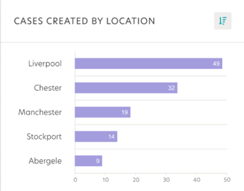
- Cases created by location: This card shows the top 5 locations with the highest number of cases created within the selected date range.
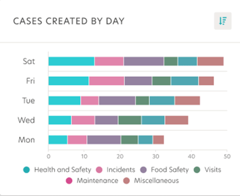
- Cases created by day: Displays the top five days with the highest number of cases, broken down by category, so you can easily spot patterns when cases are most frequently raised.
-
All three charts highlight where and when the highest volumes of cases are being created by type, location, or day, helping you quickly spot trends, focus attention on key areas, and take action to improve performance.
Tabular Data Grid:
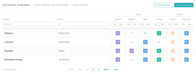
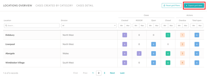
Location overview:
- The ‘Locations Overview’ data grid provides a tabular summary of each location, showing key metrics for both cases and actions. It helps you compare how different locations are performing and managing their cases and actions across the business.
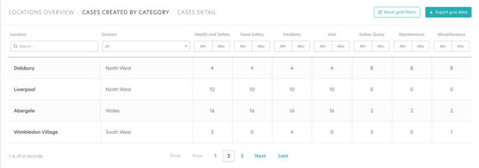
Cases Created by Category:-
- The ‘Cases Created by Category’ shows the number of cases created by category, broken down by location and division, providing a clear view of cases across the organisation.
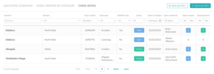
Cases Detail:
-
- The ‘Cases Detail’ data grid provides a detailed view of individual cases, including information such as case number, status, type, and date of incident, giving you a deeper understanding of each case and its progress.
-
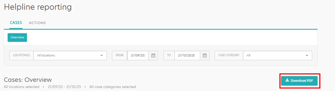
PDF and Export Function:
The Download PDF button allows you to quickly capture the entire page including charts and summaries in a convenient PDF format. This eliminates the need to manually compile visual data, saving time when reporting to the wider business.
-
The ‘Export Grid Data’ button at the bottom of the grid allows you to export the selected information into a CSV file. The export includes additional related data beyond what’s visible in the grid, enabling deeper analysis or integration with other reporting tools.
-
Transition Plan
The new style reports will be available in phases in beta to all users. The classic reports will be phased out over time. We recommend transitioning to the new reports as soon as possible to take advantage of the enhanced functionality.
What’s Next?
Over the coming quarter we will be releasing the following helpline reports :
- Health and Safety
- Incidents
- Food Safety
- Visit
- Safety Query
- Maintenance
- Miscellaneous